Hue and the Colour Wheel

Hue is simply the name of the colour that is perceived by your brain. E.g. is it yellow, green or red etc. In fact the words ‘hue’ and ‘colour’ are completely interchangeable. The word ‘pigment’ refers to the ingredient in a paint which is there to give it its colour.
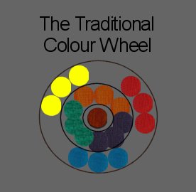
Most people understand the basic colour wheel. It is the pattern created when we take the three primary colours : red, blue and yellow, and mix them with each other in pairs to create the secondary colours : green, orange and purple. When we mix all three primary colours we get the tertiary colour brown. Traditionally, artists place the three primaries equidistant from each other around the wheel so that each sits opposite the secondary colour created by mixing the other two primaries. So red sits opposite green, blue sits opposite orange and yellow sits opposite purple. These colour pairings are described as being ‘complementary’ and are generally considered to look effective when placed together (though I personally take issue with the yellow and purple which I’ll come to later on).

What do Artists mean by 'tends to'?
Leo is an ordinary boy who dreams of being an explorer, but when his Grandma gives him a special painting he ends up on a magical and multicultural adventure that is far more than he bargained for.
Join Leo on a quest to find his way home from a very mischievous house with enchanted slides, cheeky squirrels, sneaky swings and a wacky never-ending staircase. In Leo’s company you’ll discover that at the end of the rainbow there is not only treasure but the greatest treasure of all.”
Ages 5 to 9 years.
The first important thing you need to know about the
colour wheel is that, unlike the cyan, magenta and yellow in your
printer, few of the traditional artist’s pigments sit neatly in the
position of pure red, pure blue or pure yellow. This means that before
you can do any paint mixing with a colour that is new to you, you need
to know which side of the pure primary colour it sits.
When artists describe this they use the phrase ‘tends to’. For example, take the colour Cadmium red. Although you may not see it, Cadmium red has some yellow in it. It must do because if you mix it with a blue to try to get purple you will get a very dirty tertiary purple instead. For this reason we say Cadmium red tends to orange, and it does indeed make a good orange. Likewise Cadmium yellow must have some red in it because if you try to mix it with blue to get green your green will always end up very dirty looking too (i.e. it will again have the tertiary colour brown in it). Care should be used with this phrase. Sometimes highly capable artists get it wrong. A few of the traditional artist’s pigments do actually sit quite close to the pure colour. For example Lemon yellow is often described as tending to green simply to differentiate it from Cadmium yellow, and it is true that it does make a very ‘clean’ green, but it is equally good for making orange so to say that it 'tends' to green is not really accurate. Lemon yellow is in fact very close to pure yellow.

Making Colour Mixing Charts
So, to get to know the pigments you own it is a good idea to paint colour charts. I have created some here using a few of the different primary colours that I have in my box at the moment. I have purposely not included paints that visibly have a lot of tertiary brown in them, generally known as the ‘earth’ colours or ‘naturals’, as they will obviously have a lot of all three primaries in already.
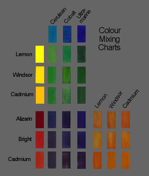
When you first study these charts in detail you may spot specific points of interest, such as the fact that the cleanest purple is achieved by mixing French ultramarine and Alizarin crimson. Also the cleanest secondary colour by far is the green created by mixing Cerulean blue and Lemon yellow paint. There is no detectable brown in it at all and therefore we can conclude that Cerulean blue is very close indeed to pure blue. (Think about it, it’s similar to cyan in your printer).
However, the most important fact of all is observed if you sit back and look at them all much more generally. Notice that any variation in the orange colours is barely visible, there is some variation in the purple colour range, but there is much greater variation in the greens. Is it simply because I was not as accurate about mixing paint in the same proportions when I did the green chart? I’m sure I did make errors but I can assure you that I will have made similar errors when mixing the oranges and the purples. The reason why the green colours vary more is that you only have to add the tiniest lick of blue to yellow paint or vice versa and it has a far greater effect on the colour produced than when you are mixing the other secondaries. There are, in short, far more greens than there are purples or oranges. Now that fact should be ringing alarm bells. If there are more greens than there are purples and oranges, why do they occupy the same amount of space on the traditional colour wheel? Well the traditional colour wheel is just a map to show you which two opposite colours match to make brown. It’s a bit like the London underground map though. Its not a true representation of the space taken up. So, if we are talking about wavelengths, the answer is they shouldn’t.

The Wavelength Colour Wheel
If, instead of the traditional colour wheel, we take the wavelengths of all the hues in the visible spectrum (a range of about 250 nm) and wrap them around in a circle to form a new colour wheel we find that what we perceive as green in colour actually takes up about one third of the entire spectrum, whereas orange takes up only about one twelfth. The reason why I couldn’t get a lot of variation in the oranges is simply that there isn’t a lot to get.
So, if we start to look at the complementary pairings across this new colour wheel what do we find? In particular what do we find opposite Lemon yellow? Is it still my dreaded purple? No, to my intense relief, it’s not. It is a much bluer colour somewhere inbetween Cobalt blue and French ultramarine. I still don’t go a bomb on a Lemon yellow and ultramarine paint combination, but if I’m forced to pair any other pure colour with Lemon yellow then Cobalt blue is the one I’d personally plump for. Have a look at how Vermeer used it below.
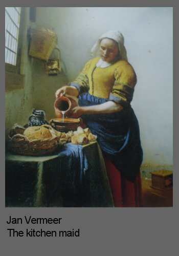
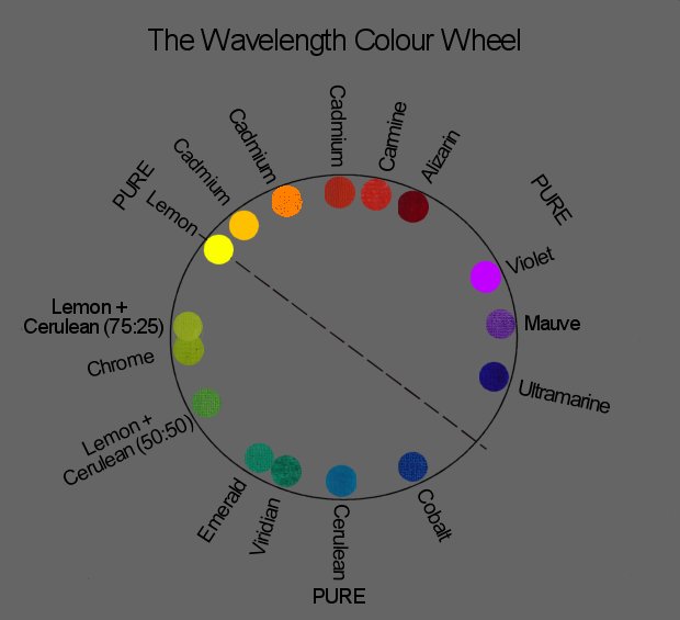
As for the other colour pairs, they too have changed and yes I still like them, but sometimes no more than I liked their pairings in the traditional colour wheel. So this is the point at which the line is drawn for me – both literally and figuratively. Figuratively because further scientific analysis is not the answer for me; instead I prefer to rely on artistic judgement. And literally because that is what I mentally do; I draw a line from Lemon yellow through to the blue at the other side and I bear in mind that most colour pairs on the opposite sides of that line will generally complement each other well. This line is the dividing line between what we describe as the ‘warm’ and the ‘cool’ colours which you can read more about in ‘Contrast is King’.
Summary
To help with colour mixing it is useful to paint charts of your pigments to learn which way they ‘tend’ and to understand which other colours will complement them best. Painting colour charts helps you to learn which colours you can’t achieve as well as which colours you can. This, in turn, helps you decide which ones you need to buy and which ones you can save money by making up yourself.
Did you like this page?
Copyright Fiona Holt 2024


