Contrast is King

I have no reservations in saying that contrast is the key to a good painting.
As far as I am concerned this is a golden rule for artists. It may well be applied in a plethora of different ways by different painters, but it is never, never broken. If the eye travels over an expanse of similarity it passes over it quickly and soon leaves it, just as it does when skimming text in a boring, repetitive book. But when it finds contrast the eye is excited and its interest is held by that contrast. Truly exceptional artists will then use rhythm and composition to lead their viewers around the painting to the next interesting contrast and so never allow them to leave. This crafting in a piece of artwork is what we are experiencing when we say:
"I couldn’t take my eyes off it’"
If you take one thing away from this website with you, ‘Contrast is King’ would be a good one to take.

Warm and Cold Colours
So, how do artists achieve contrast? Well, I touched on the beginnings of it in Hue and the Colour Wheel. Most painters know that colours on the opposite sides of the traditional colour wheel complement, or contrast, each other well, and, if we look at the wavelength colour wheel, we can draw a line from Lemon yellow to a blue somewhere between ultramarine and Cobalt which roughly separates what we call the ‘warm’ and the ‘cold’ colours, so perhaps that is a good place to start.
Why do mountains often have a bluish tinge to them? It’s not because they are blue, it’s because over long distances blue is the last colour to be filtered out by the atmosphere. That is to say, by the time the light bouncing off the mountains reaches your eye, blue is the only wavelength left in it. In contrast, red is one of the first colours to be filtered out, so red objects in the distance rarely appear red. For this reason artists call red a ‘warm colour' and we know that putting red in any object in a painting automatically brings it forwards, whereas, blue is a cold colour and artists can use it to make objects appear distant. Any colour which has blue in it is generally described as cold – that is from the yellowy (or spring) greens, round to cobalt blue; and any colour which has red in it is generally described as warm – that is the oranges, reds, crimsons and purples. Now the best way to use this knowledge is not to use a warm or cold colour on its own, but to contrast the two by placing them adjacent to each other.
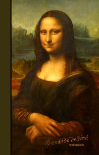
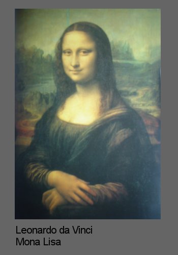
Look at the Mona Lisa and see how Leonardo da Vinci painted the scenery behind her. In the distance there are the blue and green hues of mountains and water, then as the road comes forwards it starts yellow and then finally turns red. Her fingers, which are nearest to us, are the reddest of all her skin. Her face does not need to be red to come forwards, it is sufficient for it to be a golden yellow colour because it is adjacent to a contrasting blue/green background.
With a bit of thought and experimentation artists can come up with all sorts of subtle contrasts between warm and cold colours with new twists to them. For example, take French ultramarine. It is a blue but it tends to red (i.e. it has red in it). So is it warm or cold? The answer is either, it’s all relative and it can be whatever you want it to be. An artist can contrast it with a red and it appears to go backwards, or contrast it with a Cerulean or a Cobalt blue and it appears to come forwards.
"Love Art,
Love Learning"

Contrast in Tone and Saturation
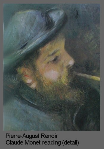
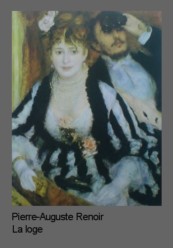
But colour contrasts don’t end with contrasting complementaries; far from it. You can also contrast tone, saturation and transparency and it all adds to the effect. Take my dislike of yellow paired with purple for example. I have briefly wondered if one of the reasons I don’t like it is that neither is particularly cold or warm (if you remember my dividing line runs from yellow to the blue side of purple). Perhaps it is, but on the other hand at full saturation they are about as far apart as you can get in tone so maybe that’s why some people do like it. One thing I do know is that if the saturation of at least one of them is altered, so that there is both contrast in colour and saturation, then I love it. I have seen some gorgeous paintings with a near full saturation purple put with a Naples yellow for example. You can use this kind of contrast with any complementary or neighbouring colours and in any combination. For example, a fully saturated red looks good contrasted with a fully saturated blue or green, but grey off the blue/green and I think the red looks ten times better. This means that adding a bright colour to a painting almost has to be earned. You have to do the ground work beforehand, building up greys, browns and shadows, and then putting the bright colour on at the end is like putting the icing on the cake. Have a look at these portrait paintings by Vermeer and Renoir as different types of examples of contrast.
In La loge Renoir has used the ultimate contrast of tone - black against white - with great effect. Manet also did this alot though his preference was usually blue with white.
Summary
Contrast is definitely the key to a good painting. Not only can artists contrast complementary warm and cold colours, but they can use contrast in saturation and transparency as well as colour. Try, for example, preparing a ground for a skin tone by layering a transparent glaze of burnt Sienna (a very warm red brown) over a dried pure white ground. Paint the majority of the portrait and then, when you come to do the highlights on the face, make them an opaque white with just a touch of cool blue in them to complement the red of the Sienna ground. Also try contrasting elements other than colour in your portrait. For example if forms in the distance, over a subject’s shoulder perhaps, are kept rounded, then a sharp angular piece of jewellery, or shape in the face, in the foreground will contrast well.
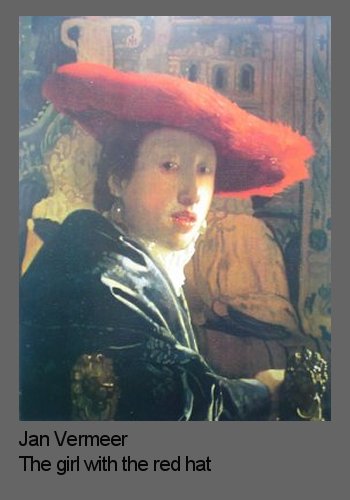
How did Vermeer get away with painting that hat?
First of all the expanse of red is not as great as you might at first assume. Yes the hat is large, but only about one third of it is pure red, the rest is, in contrast, in shadow and therefore a red brown. Vermeer has not used contrasting colours to surround the hat (no blues or greens), instead he has used similar colours but ensures that practically every single part of the pure red hat contrasts in saturation against the background. There is nothing in the painting to compete with it, except a touch of pure red in the lips which cleverly ties it together and prevents the hat from feeling too alien.
A great opportunity to convincingly add bright colour, and a favourite trick of the impressionist painters, was to put pure colours in as reflected light in shadows. This is what Renoir has done in this portrait of Claude Monet. The majority of the painting: the hat, coat and background, are all in blue and green greys and browns. Then in the beard and ear he adds flecks of gorgeous pure reds and warm yellows which contrast the blues and greens beautifully.
The impressionists would also put pure mauves in the shadows of white objects with great effect. You often see it, for example, painted into the shaded side of a white house with a strong Mediterranean sun shining on it.
Did you like this page?
Copyright Fiona Holt, 2024
