Tone, Transparency and Saturation

Tone is a very general term that is simply used to describe the lightness or darkness of a colour. What artists need to be most aware of here is that a colour may be light in tone either because it has white added to it or because its natural appearance is light. For example, a pure Lemon yellow on its own, which has a naturally light tone, might be described as being the same tone as a mix of Cadmium yellow and a little white. Both can also be said to be yellow; however, their similarities would stop there.

The key difference between a pure Lemon yellow and a Cadmium yellow/white paint mix is in their transparency. You see, many of the artist’s oil pigments are transparent. This means that if you paint a thin to medium brush stroke on top of a previously dried pure white background, that pure white background will come through the transparent paint and make it shine. Likewise, if you painted a brush stroke on a piece of glass and held it up in front of a window, the light from the window would shine through it too. There are, however, a few notable exceptions. The most common are the Cadmiums and, more crucially, white. This means that the moment you mix white into an oil colour it becomes opaque and any background colour (imprimatura) will not shine through it. This does not mean that you cannot make a colour containing white appear to shine brightly in an oil portrait painting. Any light toned colour can be made to appear to shine brightly by simply placing it next to a very dark colour (Contrast is King). But, if you place both a whitened colour and a pure colour with white behind it, both in a juxtaposition with a dark area, the visual effects of each will be very different. When I first started painting I thought that the more white I added the brighter my colours would always appear but I was utterly, utterly wrong.


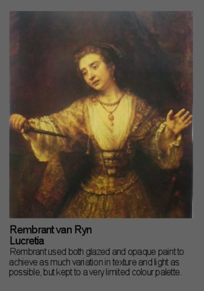
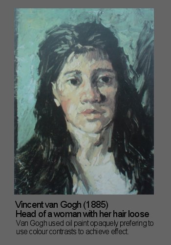
The process of applying thin layers of transparent paint and allowing the imprimatura ground (i.e. the background) to show through is called ‘glazing’ and it is a process that can only be done with transparent mediums like watercolours and oils (gouache and pastels are opaque). Though many fantastic portrait artists who use oils may not particularly choose to use the quality of transparency, don’t think for one minute that they do so unknowingly. Two comparative examples are these two portraits by van Gogh and Rembrant.
Saturation (Intensity) of Colour
Several times I have referred to paint colours as being ‘pure’ or ‘clean’. What I should really be saying is ‘fully saturated’ or ‘maximum intensity’. A colour is at its maximum saturation or intensity simply when no other colour – whether black, white or skyblue ginger – interferes with it at all. At full saturation a colour may therefore be dark, e.g. an indigo, or light, e.g. a yellow ochre, in tone.

Summary
Learn the properties of the oil colours you own. Are they light, mid tone or dark? Are they transparent, opaque, fully saturated or a bought mix containing white or another colour already? Try taking a fully saturated colour and see how many steps of clearly distinct tone you can create by adding different amounts of white to it. i.e. create a tonal series in one hue. The number of steps will be far greater for a naturally dark toned pigment than for a light toned one.
Did you like this page?
Copyright Fiona Holt 2024
