Composition and Rhythm

Most portrait artists like to have an idea of the layout of their painting before they start. The processes they use to get there may vary, but it helps to have some kind of a mental map, or composition, before they begin to paint. It always amazes me how rapidly people seem to start painting at my portrait group. If you have a sitter, take some time to wonder around looking at them and decide on a composition you like. Some artists use a view finder (a little rectangular frame) to peer through or alternatively you can use your thumbs and forefingers to make a box to look through.

"Love Art,
Love Learning"

Composing your Portrait
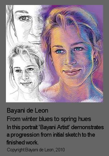
The traditional way to compose a painting is, of course, to do a sketch. Many artists do this because they feel it helps them to get to know their way around the painting as it were. Have a look at this example kindly provided by the portrait artist Bayani de Leon ('Bayani artist' can be found on flickr.com and is well worth a visit).
I personally dislike doing sketches to find my composition. I find that I don’t tend to care enough because I have in my mind that it’s only the sketch and not the real thing. I also find that I suffer from boredom when I come to do the actual portrait painting. For me it’s a bit like reading a good book. If I’ve just finished it, even though it was good, I don’t particularly want to go back to the beginning and start all over again! Don't worry if you feel the same; it doesn't mean that you are not a proper artist. I am not ashamed to say that at home I make full use of my pc. I use the drawing package Paintshop Pro to collect, store and manipulate images. I cut and paste different bits of different images to make up my own compositions. I can change backgrounds and colours in an instant and learn compositional lessons that I used to have to paint an entire portrait to learn. I suppose the next step down the line for some from this might be digital art, although I doubt I will ever take that route. I enjoy painting too much.

Some ‘Rules’ of Portrait Composition
While it is often true to say that rules are there to be broken, with composition it is probably more accurate to say that there are just endless ways of interpreting the rules. I tend to find that portrait paintings which appear to break compositional rules and get away with it actually haven’t broken the rules at all, they’ve only tricked you into thinking they have. On closer inspection you can usually find the reason why a portrait has worked and so ultimately ‘rules’ get reinforced rather than rejected. So what are the rules of portrait composition? Here are a few pointers to get you started.
1. You've got to make a painting of a portrait
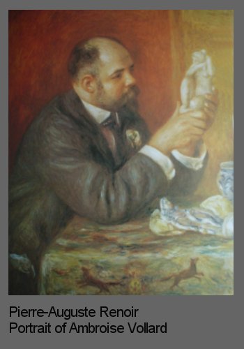
You’ve got to make it interesting. Generally speaking just sticking down a head, floating in the ether and cut off at the neck, doesn’t work. On the occasions that it does it will be because the artist has provided something of intense interest to hold your attention. Bayani artist above, for example, holds your interest by working with beautiful vibrant lines of colour. The more common way that portrait artists use composition to hold your interest is by including something other than just a face. It may be a piece of jewellery, a patterned item of clothing, an expressive hand gesture (most portrait artists are just as experienced at painting hands as they are faces) or an article with a strong association to the sitter that tells you something about who they are. In his portrait of the art dealer Ambroise Vollard, Renoir intentionally has his subject’s hands lovingly holding a small sculpture. The hands add an emotive quality to the portrait and the sculpture gives a narrative about the sitter’s occupation.
3. Provide focal points in your portrait composition
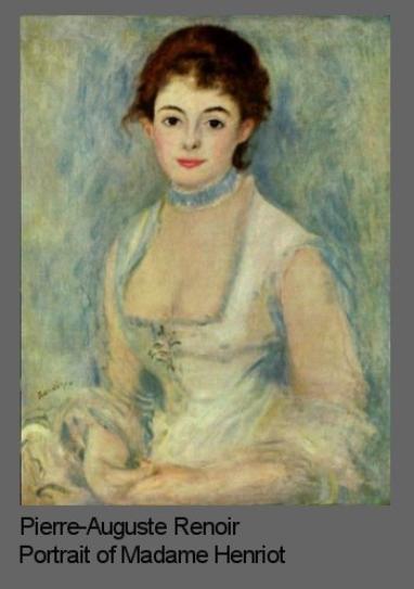
Frequently, though not always, the focal point of a portrait is the eyes. Look at this portrait of Madame Henriot by Renoir. See how everything is painted very loosely and impressionistically except the eyes which pierce you and keep drawing you back to them. To reinforce your focal points (and you may well have more than one) make the contrast between light and shadow much greater than anywhere else in your portrait painting. This doesn’t mean you can’t have bright colour elsewhere in your portrait (in fact bright colours in the foreground of a portrait often work extremely well), just don’t do quite as much detail in the non focal areas and don’t heavily contrast bright areas that are outside your focus area(s).
4. Defy age with a side profile
There is a reason why historically monarchs often have their side profile portrait on coins. The focal point of a side profile is rarely the eye, but the actual silhouette itself. This is determined by bone structure and changes far less with age than a front facial image does. So aging monarchs liked to have side profiles on coins and in portraits because it made them look younger.
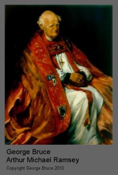
Have a look at this painting of Michael Ramsey by George Bruce who is one of my favourite contemporary master portrait artists. See if you can identify how his rhythmic loop locks you in?
Though it is not a portrait, if you want more, another great example is Daniel in the Lion’s Den by Rubens. Put it into Google Images and have a look.
6. Think about the space you leave around your model
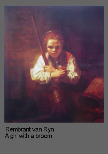
If you want to emphasise that a person, perhaps a child, is small, then leave plenty of space around them and particularly above their head in your composition. In this painting by Rembrant the girl looks small and vulnerable because she is surrounded by a large amount of space. Beware not to fall into the trap of not having enough areas of interest in terms of warm or light colours in the portrait. This portrait would not work if Rembrant had left the background all black. He purposely suffuses the canvas with a glaze of a very warm red brown to combat this.
Equally, If you want a person to appear important, tall and domineering, then leave very little space above their head in your composition, i.e. make them dominate the portrait space.
2. The weight distribution has got to be convincing
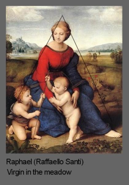
The traditional compositional design for a portrait is called ‘the pyramid’. There are literally thousands of examples of pyramidal portraits to be found including the most famous one of all, the Mona Lisa. But I have already used the Mona Lisa on another page and I like to keep things interesting, so here, instead, is a Raphael to demonstrate what I mean. In the pyramid composition, the head sits in or near the central vertical plane of the portrait and the weight of the head is convincingly supported by the wider base of the shoulders and body. In this particular painting Raphael has included the children within his pyramid composition for even greater stability.
If a figure is painted at an angle, with the weight of the head not directly above, and within the width of, the hips, then you will have to provide a convincing reason why not. This may be, for example, a cushion for the head to lean against, or it may be a sportsman who clearly has the energy of movement to support his stance. This latter example can be extrapolated more generally in that figures and appendages convincingly painted at an angle often portray energy, whereas horizontal lines in a portrait composition often denote calm.
5. Use rhythm & line to lock your viewer into your portrait
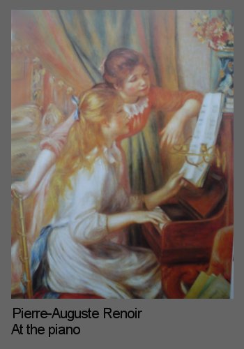
Rubens was a king of rhythm, so was Van Gogh. Renoir (who interestingly seems to be dominating this webpage!) uses it in the composition of this portrait of two girls at the piano with great effect. I start by looking at the head of the girl who is standing. There is a strong contrast between her hair and the pale green curtain behind so my eye is drawn to that focal point. Then I automatically follow the line of her arm down behind the blonde girl’s back. At her forearm the line merges with the blonde’s hair and my eye is forced around to the blonde’s skirts which are purposely curved upwards leading me to her hands, these also point upwards. I find myself looking at the piano manuscript, then naturally I move on to the standing girl’s other forearm, leaning on the piano, and before I know it the composition has led me back to her head again. By creating this never-ending rhythmic loop Renoir is, quite intentionally, preventing me from leaving his portrait painting.
Summary
There is far more to portrait composition than meets the eye. Entire books no doubt have been written on the subject.
For those of you who are completely turned off by the thought of composing your portrait painting and love to just dive straight in, I recommend having a very large surface prepared initially so that you have plenty of space to just see where the painting takes you. It’s rather an expensive way of doing things though.
Did you like this page?
Copyright Fiona Holt, 2024
